The Rule of Thirds is often mentioned in photography but not always fully understood. It refers to composition and how you position things within your photo.
When photographing a landscape it is quite common for people to put the horizon across the middle of your frame. This effectively cuts your photo in half giving equal to the sky as to the foreground. If you have a perfect mirrored reflection this can work very well, however in other instances it can give you potentially an unbalanced photo.
For example, if you have a bland, grey, featureless sky you are potentially wasting half of your image to nothing of interest if you put the horizon in the middle. In this instance it is potentially better to move your horizon up your frame (tilting your camera down slightly) when you compose it (to the upper thirds line, see image). This will instantly give more impact and emphasis to your foreground and remove some of the wasted space of the bland sky.
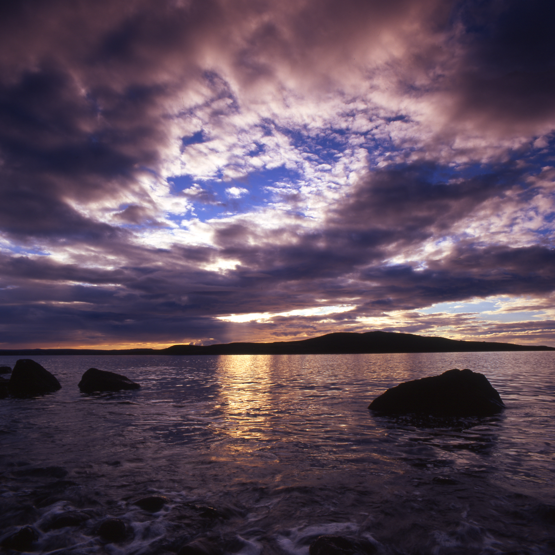
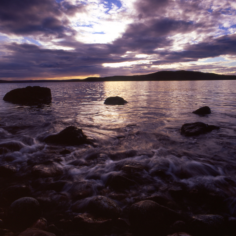
On the opposite hand, if your sky is full of drama, be it a sunrise/sunset or dramatic stormy clouds, you may choose to position your horizon lower down in your frame, to the bottom thirds line, to give two-thirds to the sky and more emphasis.
The next thing to think about is how and where you position your focal point of your image. For example if you are photographing a tree, if you place it in the centre of your frame it can sometimes split the image up so it doesn’t flow. If you re-compose so that the tree is to one side, on a ‘thirds line’ it can often site nicer and allow you image to flow.
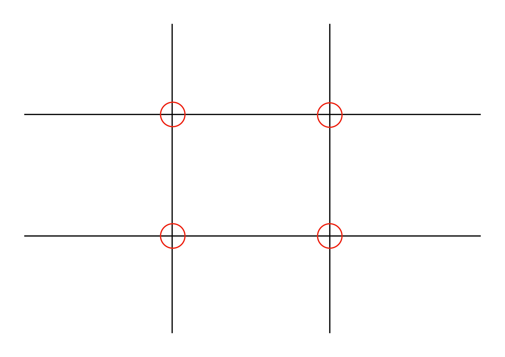
On the ‘noughts and crosses board’ image I have highlighted four spots and highlighted them with red circles. These are the ‘sweets spots’ if you like. If you can position your main focal point on one of these points it can work really well.
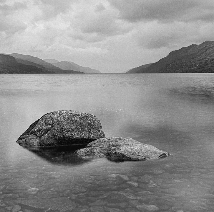
If, as an example, you are photographing a Scottish Loch with a rock in the water as your point of interest. If you position your horizon on the upper third line it instantly give more attention to the foreground. If you position the rock off centre so it falls on one of the red circle spots it will balance nicely and add a flow as people look round your photo.
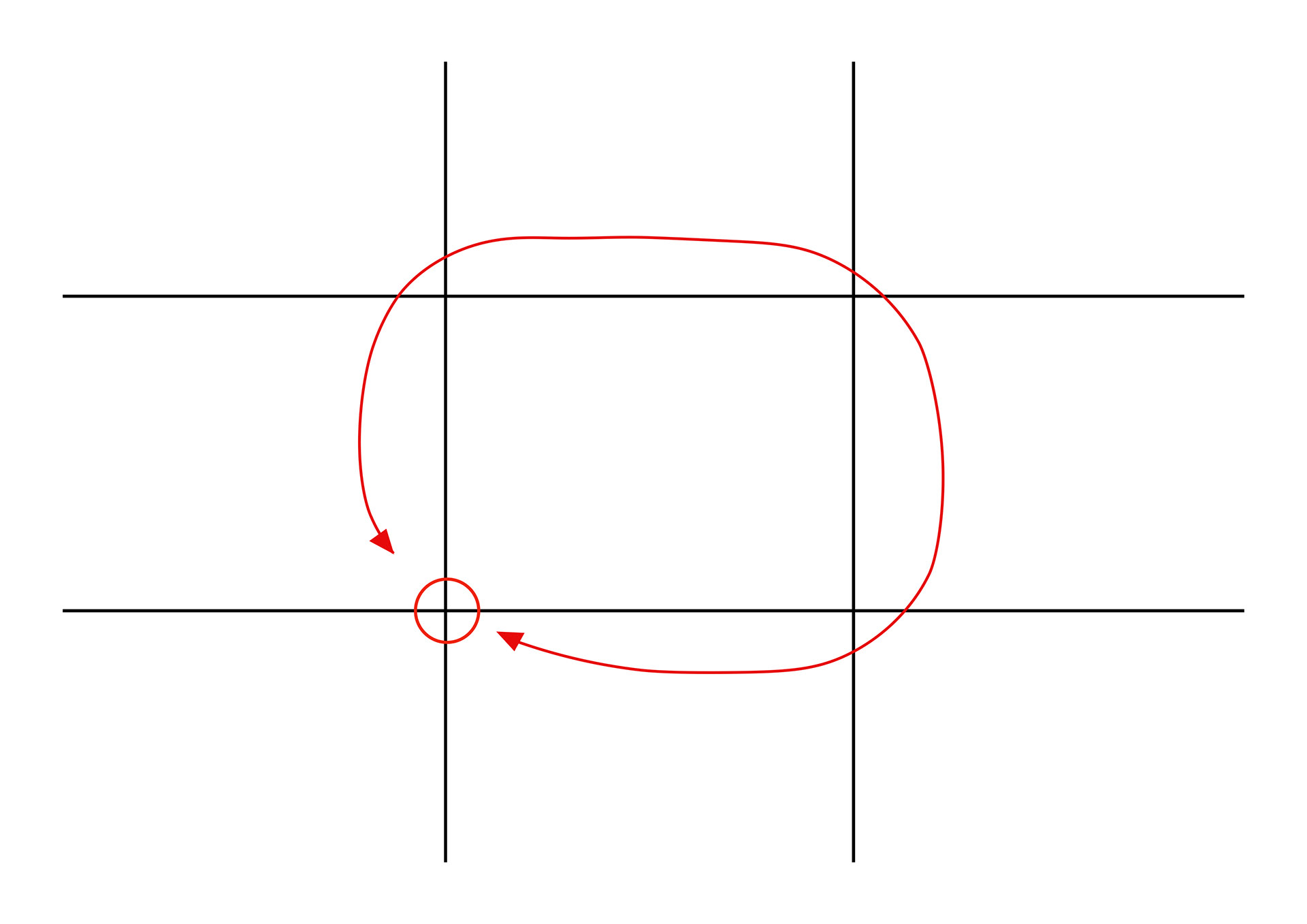
If you position the rock in the middle the person looking at your photo will look at the rock first (as it’s your focal point), then likely look to one side or the other (often to the right as we read from left to right the brain often intuitively moves to the right). They will then drift towards the background. You run the risk of them not really looking to the left of the rock, and therefore having a wasted space area.
Rules are most definitely made to be broken. Next time you're composing a photo, have a go at moving the camera position to change where things sit in your image. You may not notice at the time, but when you see them on your screen and compare them you will hopefully notice a difference and prefer one to the other.